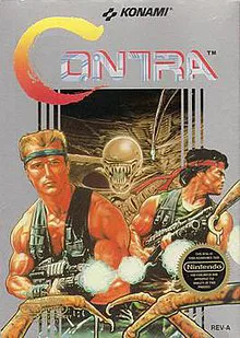
| Title: | Contra |
| Developer: | Konami |
| Publisher: | Konami |
| Designers: | Koji Hiroshita, Shigeharu Umezaki, Shinji Kitamoto |
| Composers: | Kazuki Muraoka, Hidenori Maezawa, Kiyohiro Sada |
| Platform: | Nintendo Entertainment System (NES) |
| Released: | February 20, 1987 |
This site is protected by reCAPTCHA and the Google Privacy Policy and Terms of Service apply.

| Title: | Contra |
| Developer: | Konami |
| Publisher: | Konami |
| Designers: | Koji Hiroshita, Shigeharu Umezaki, Shinji Kitamoto |
| Composers: | Kazuki Muraoka, Hidenori Maezawa, Kiyohiro Sada |
| Platform: | Nintendo Entertainment System (NES) |
| Released: | February 20, 1987 |