File under Revolutionary Opportunities
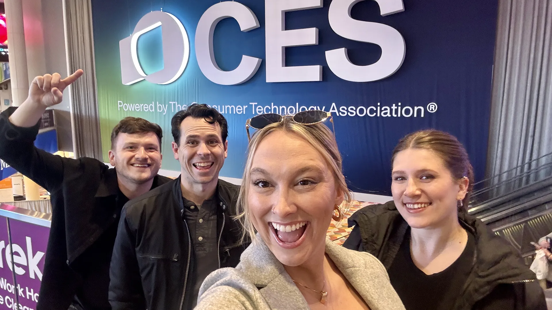
Arthur Elliott Goes to CES 2025
CES 2025 wasn’t just a tech show — it was a masterclass in branding, scale, and how to own a space.
In an environment where attention is the most valuable currency, booth displays reigned supreme. And let me tell you, the brands that got it right didn’t just show up — they transported us to entirely different worlds.
In a sea of bright lights, bold logos, and jaw-dropping tech, it became clear: at CES, your booth isn’t just a booth. It’s your message, your identity, and your first (and often only) shot to draw people in.
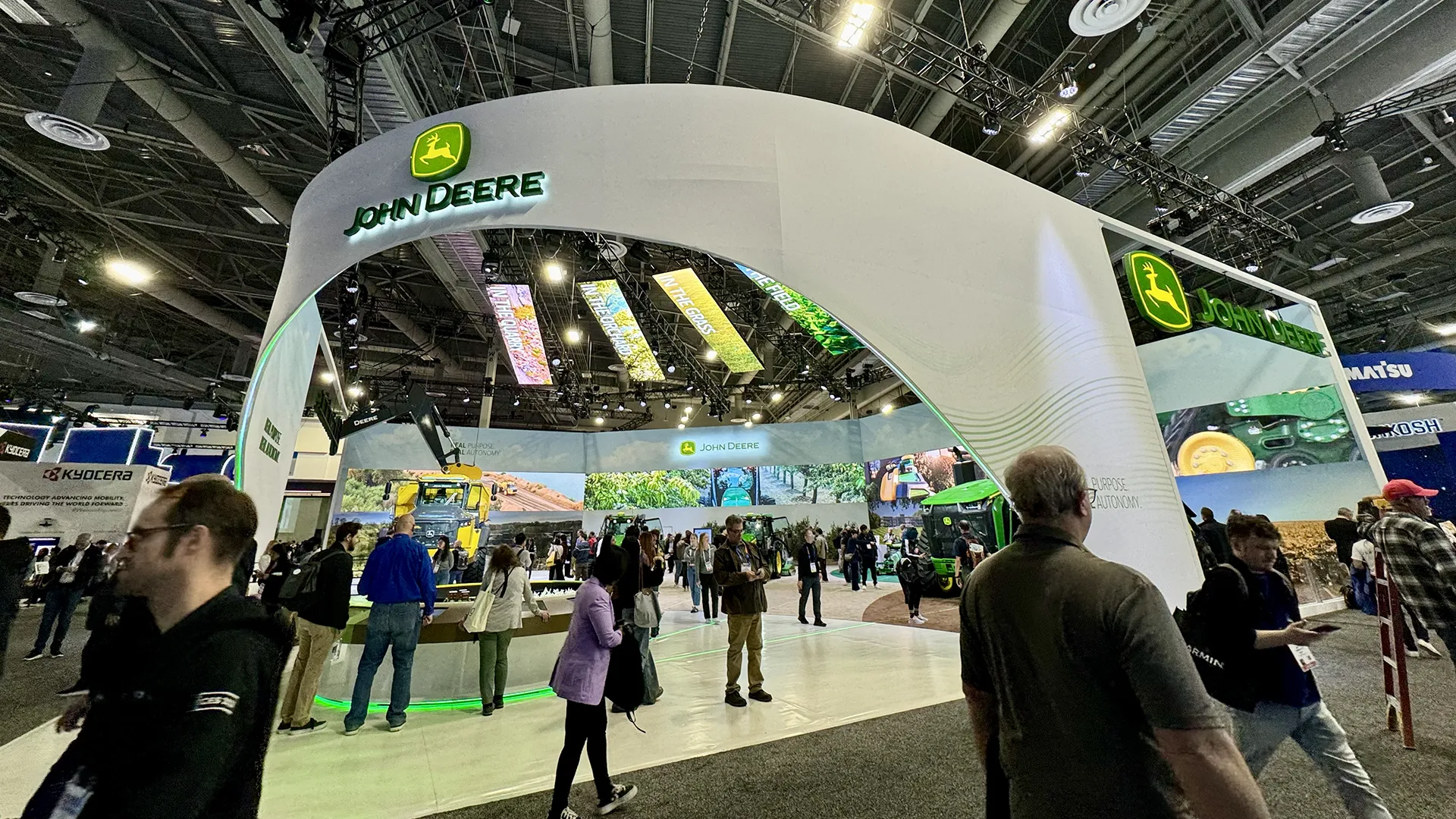
John Deere: Go Big or Go Home
(New autonomous machines and technology for agriculture, construction, and commercial landscaping including the 9RX tractor, 5ML orchard tractor, 460 P-Tier articulated dump truck [ADT], and the Merlin mower)
Let’s start with scale. John Deere took the “bigger is better” mantra and ran with it. Their booth was a masterpiece of light, size, and unexpected sophistication. A giant illuminated logo greeted attendees at the entrance — a bold move that doubled as a statement piece and a gateway into their space.
From the outside, it looked like a fully enclosed room, but those see-through showroom-style windows created an experience that was both massive and inviting. Add their signature yellow and green to a sea of tech blues, and it was a refreshing pop of personality. Oh, and did I mention the tech they had on display? It was huge — literally. Scale, light, and branding — Deere nailed the trifecta.
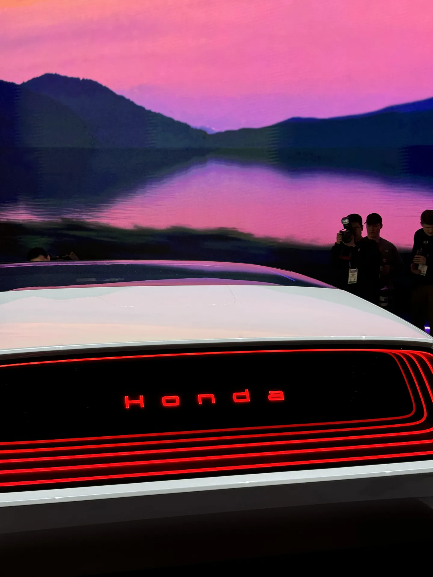
Honda: Understated, but Stunning
(New electric vehicle [EV] prototypes, including the Honda 0 Saloon and Honda 0 SUV)
Then there’s Honda. Their booth was proof that simplicity can pack just as much of a punch. They skipped the over-the-top lights and chaotic stations in favor of a sleek, stage-like setup. Picture this: a massive, seamless LED screen wrapping 180 degrees, softly pulling you in, with just two spinning platforms at the center displaying their car tech.
No frills. No clutter. Just enough to intrigue and engage. It was minimalism with maximum impact — a reminder that sometimes, less really is more.
Amazon: A Booth That Felt Like Home
(Demonstrations of cloud services, an automotive exhibit featuring BMW and Alexa, and new product announcements such as the Fire TV Omni Mini-LED series, the Kindle Colorsoft, the Smart Smoke and Carbon Monoxide Alarms, and the Floodlight Cam Pro and Spotlight Cam Pro)
Leave it to Amazon to turn a booth into a fully immersive experience. They designed their space like a house, complete with a specific entrance and exit to guide you through their offerings.
There was a living room area featuring their transparent TV, a reading nook for the new Kindle Color, and soft, gauzy white fabric that made everything feel open and airy. The booth wasn’t just showcasing tech — it was reimagining what a tradeshow booth could be. Subtle, intentional, and undeniably on-brand.
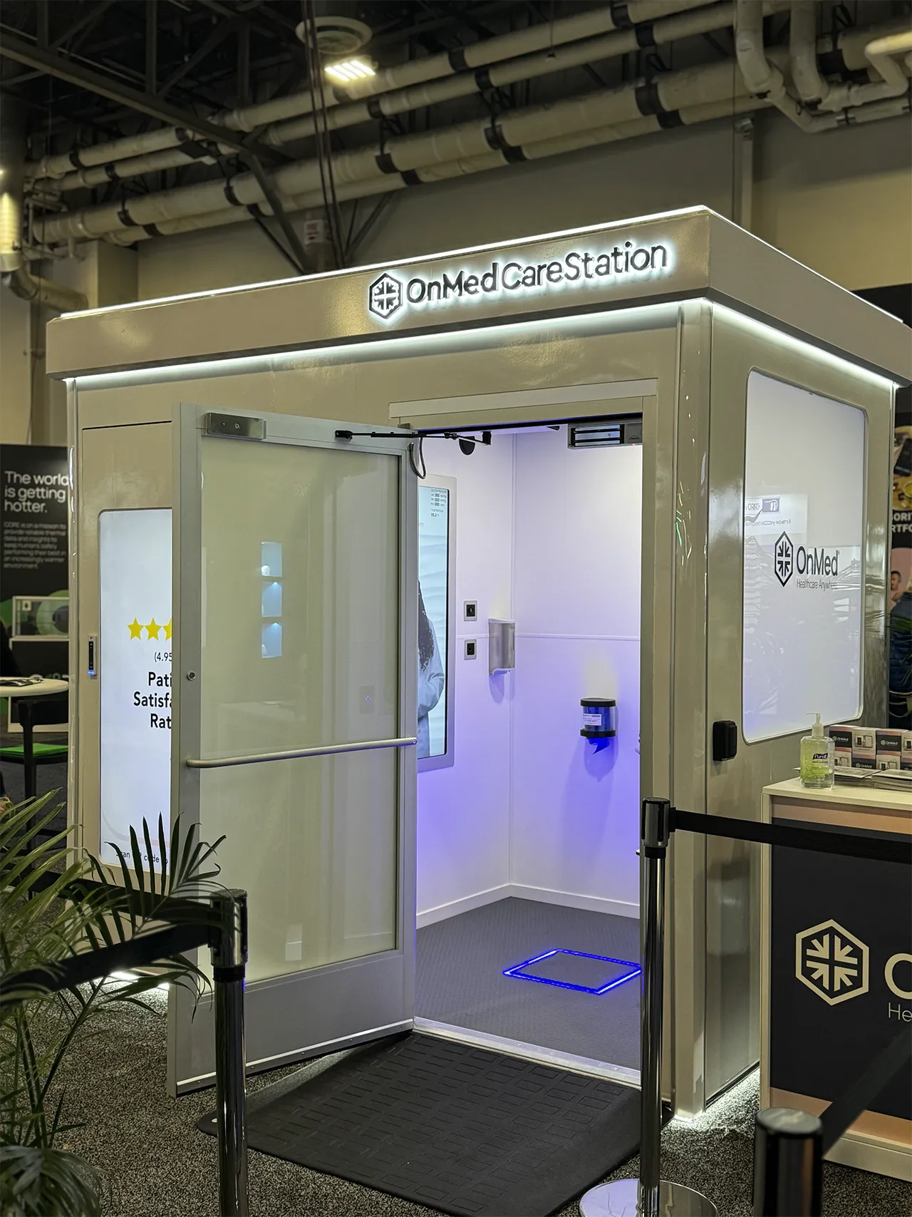
OnMed: What Happens When the Mission Does the Talking
(The revolutionary “Clinic-in-a-box” OnMed CareStation)
OnMed took a completely different approach — and it was nothing short of brilliant. While others went big and bold, OnMed kept their booth clean, simple, and entirely mission-driven. A branded sign hanging above, a few leafy plants, white leather chairs, and the centerpiece: the revolutionary OnMed CareStation. That was it.
But this wasn’t just minimalism for the sake of aesthetics — it was intentional. Their booth was a reflection of their mission: transparency, accessibility, and healthcare for all. No distractions. No gimmicks. Just a clear message — healthcare should be clean, simple, and available to everyone.
And the impact? Undeniable. With media swarming their booth and attendees stopping to learn more, OnMed’s approach proved that sometimes, simplicity speaks louder than anything else. Their booth wasn’t just a display — it was a statement.
Headlines Matter (But Not for Everyone)
One thing I couldn’t help but notice as the writer of this blog? The use — or lack of — headlines.
With so many brands competing for attention, I was surprised how many booths relied solely on logos or reps to communicate their message. Take Smart Eye, for example. Their headline, “Your face is the interface. Blink twice to start,” was short, engaging, and directional. It caught my eye immediately and told me exactly what they were about — no sales pitch needed.
So, What Did We Learn?
At CES, your booth is more than a display — it’s your entire brand distilled into a single experience. Whether it’s John Deere’s bold scale, Honda’s clean simplicity, Amazon’s immersive world-building, or OnMed’s mission-driven minimalism, the best booths tell a story.
And let’s not forget the power of a well-placed headline. In a crowd full of distractions, a few words can make the difference between someone walking by and stopping in their tracks.
As for the Arthur Elliott team? CES opened our eyes to a whole new year of creative possibilities. From lighting up the room with bold ideas to stripping things back and letting simplicity shine, we’re inspired and ready to help brands show up — and stand out — on any stage.
Cheers to big ideas, bold branding, and the spaces that make it all possible. Until next year, CES.
