From Site to Skyline: A Brand Built For Everywhere.
The Challenge
Concorde was growing—fast. From Charlotte to Charleston, adaptive reuse to high-rise towers, their footprint was expanding. But their brand? It hadn’t caught up.
There was no cohesion. No scalable system for multi-site visibility. Internally, teams lacked the language to represent the company consistently. Externally, clients couldn’t see the full scope of what Concorde could do.
To compete in a booming market and lead across industry verticals, Concorde needed a brand that could show up sharp—on every screen, site, and skyline.
Our Strategy
Make the brand work as hard as the teams do.
- Discovery Across Departments Insights from job sites to boardrooms shaped a unifying truth: Concorde builds better.
- Brand Platform & Rallying Cry WAY BETTER became more than a line—it became a mindset.
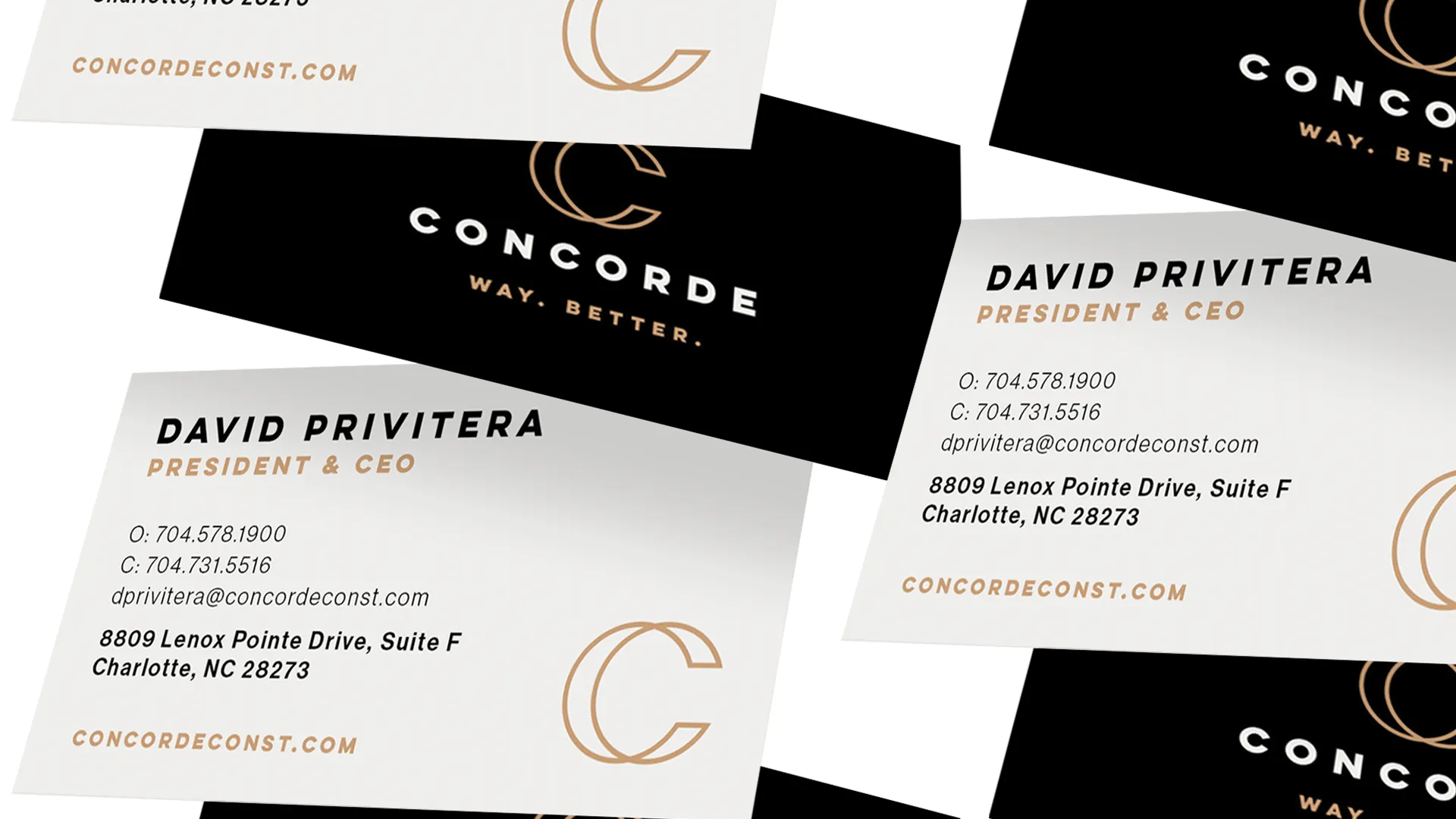
- Scalable Identity System Designed for versatility—from copper hard hats to branded fence wraps.
- Internal Rollout Activated teams across locations with training, tools, and on-brand assets.
- New Website Built to support recruiting, RFPs, and multi-market visibility.