Creating a Story from the Ground Up.
The Challenge
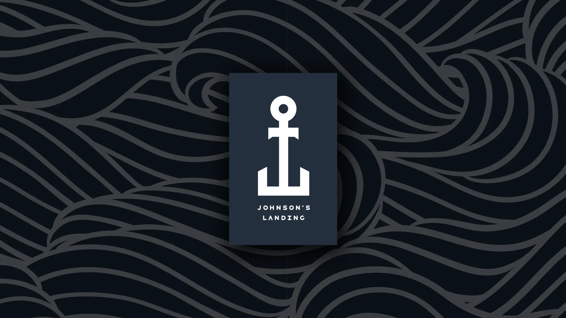
Before it drew crowds, Johnson’s Landing was just land—with no story, no presence, and no reason for locals to care. The team didn’t need a name—they needed a brand that could turn a restaurant concept into a beloved institution. And fast.
Our Strategy
We built it from scratch:
- Named it “Johnson’s Landing” to root it in local pride
- Created a custom J+L anchor logo that became the face of the brand
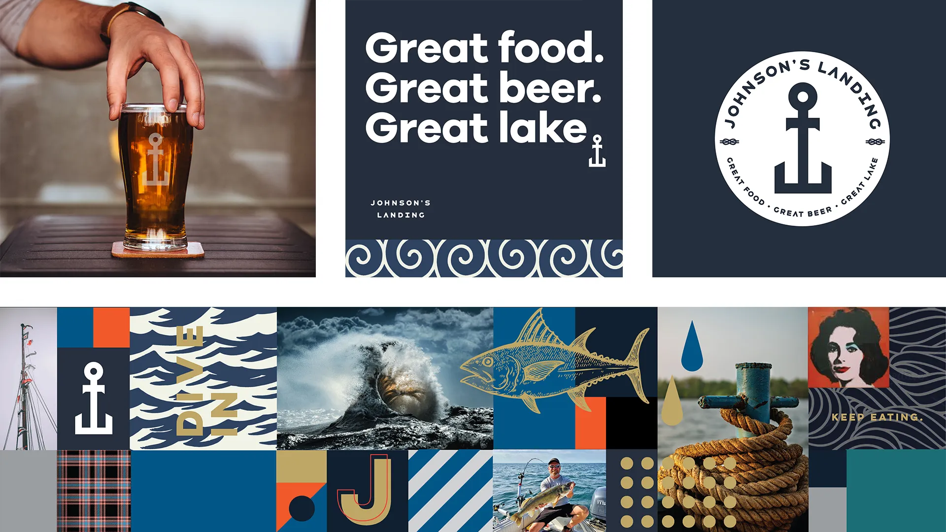
Then we gave it personality and presence across every touchpoint:
- Messaging for investors and permitting
- Menus, merchandise, and full brand environment
- Digital, social, and paid content to drive pre-launch buzz
And then, we put it on cans.
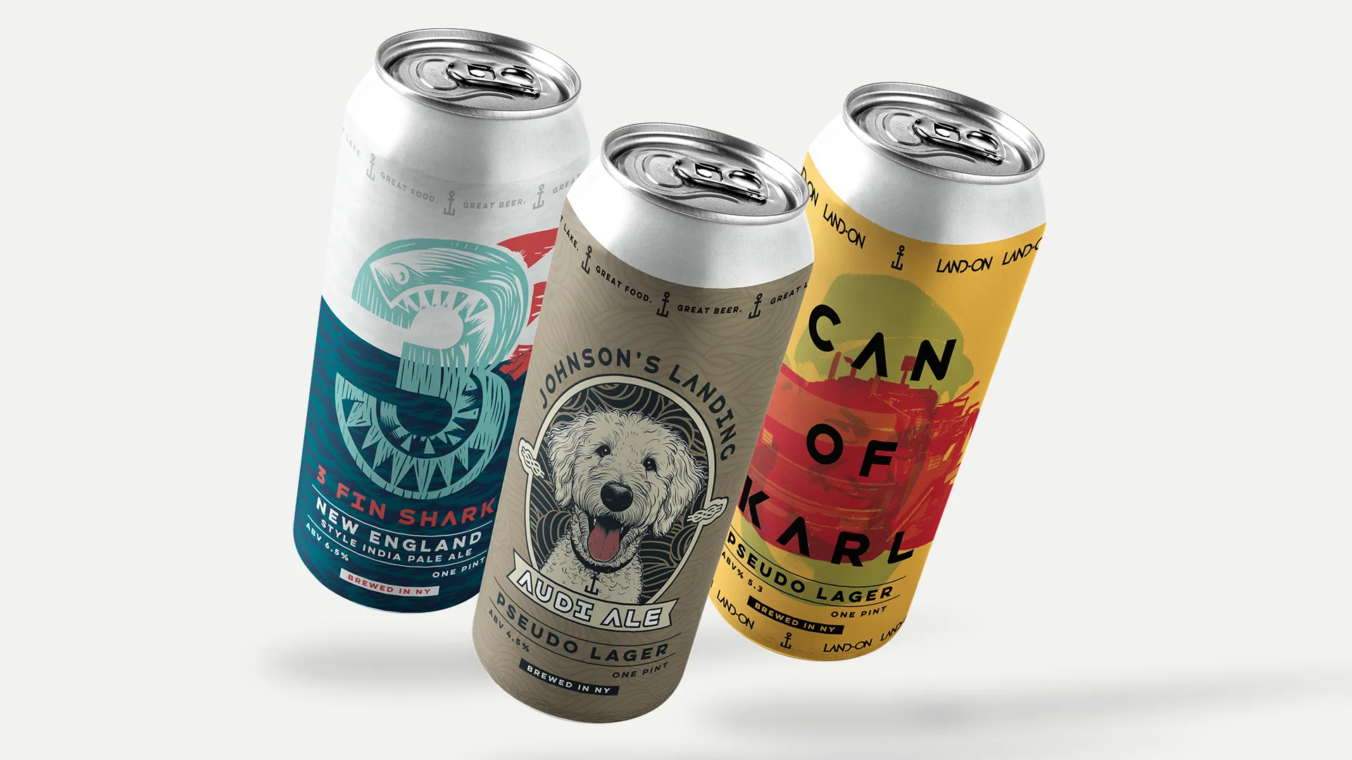
We designed three beer labels, each telling a personal story:
- The 3-Finned Shark (an inside joke)
- Funkle Karl (a family tribute)
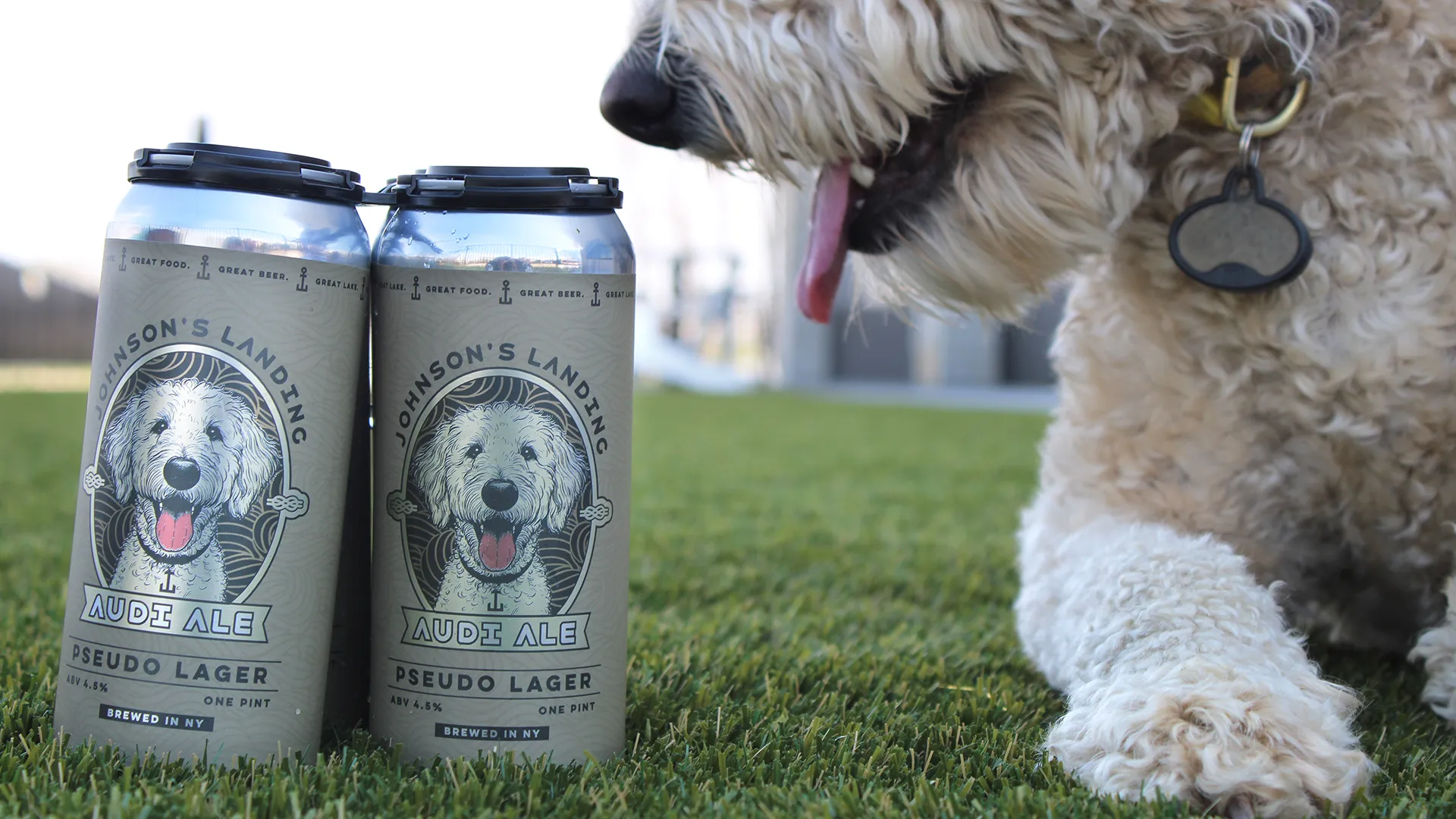
- Audi (the family dog)
The cans became crowd favorites—personal, shareable, and deeply local.
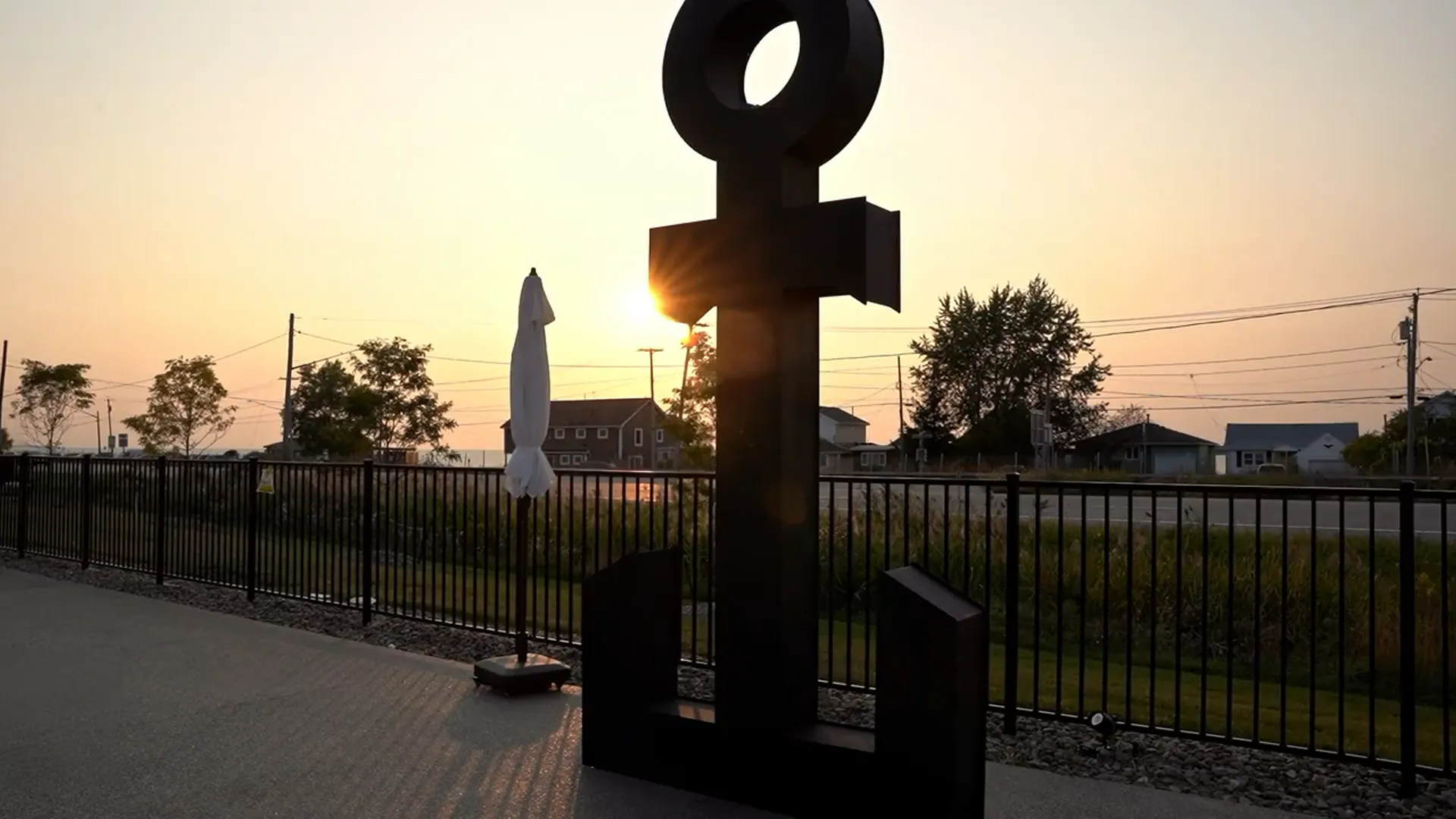
We also tackled a visibility issue: city code banned traditional signage. Our solution? A 20-foot, bottom-lit anchor sculpture—doubling as public art and brand beacon, visible from miles away. CRE developers now ask, “Can you help solve zoning challenges?” We point to the anchor.